¶ 1. Overview
The Data Form is the T6 feature used to view, insert, update, and remove records from a Data Table. It works as an interaction interface with the database, allowing you to configure which fields will be displayed, which actions will be available, and which rules will apply during use.
When creating a form, the first step is to decide how it will be linked to a Data Table:
- Creating a new table, directly in the editor.
- Using an existing table, previously configured in T6.
¶ 1.1. Prerequisites
To access this feature, you must enable the DataForm New Create or Edit preview.
To create and edit data forms, the following permissions will be required:
The user must have the following Manager Features enabled under Permissions:
It will also be necessary to be associated with a global group with the following Manager Features enabled:
¶ 2. Features
¶ Association with a Data Table
- Create a new Table: When selecting this option, a side panel will open. In it, you can configure all the fields of the new table without needing to switch tabs or leave the current screen. For more details about this process, see the Data Table creation documentation.
After creating a new table through this screen, the data form will open for editing without the need to access other screens.
- Use an existing Table: A dropdown will display all registered tables. Just select the desired one to link it to the form.
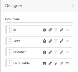
¶ Editor Structure
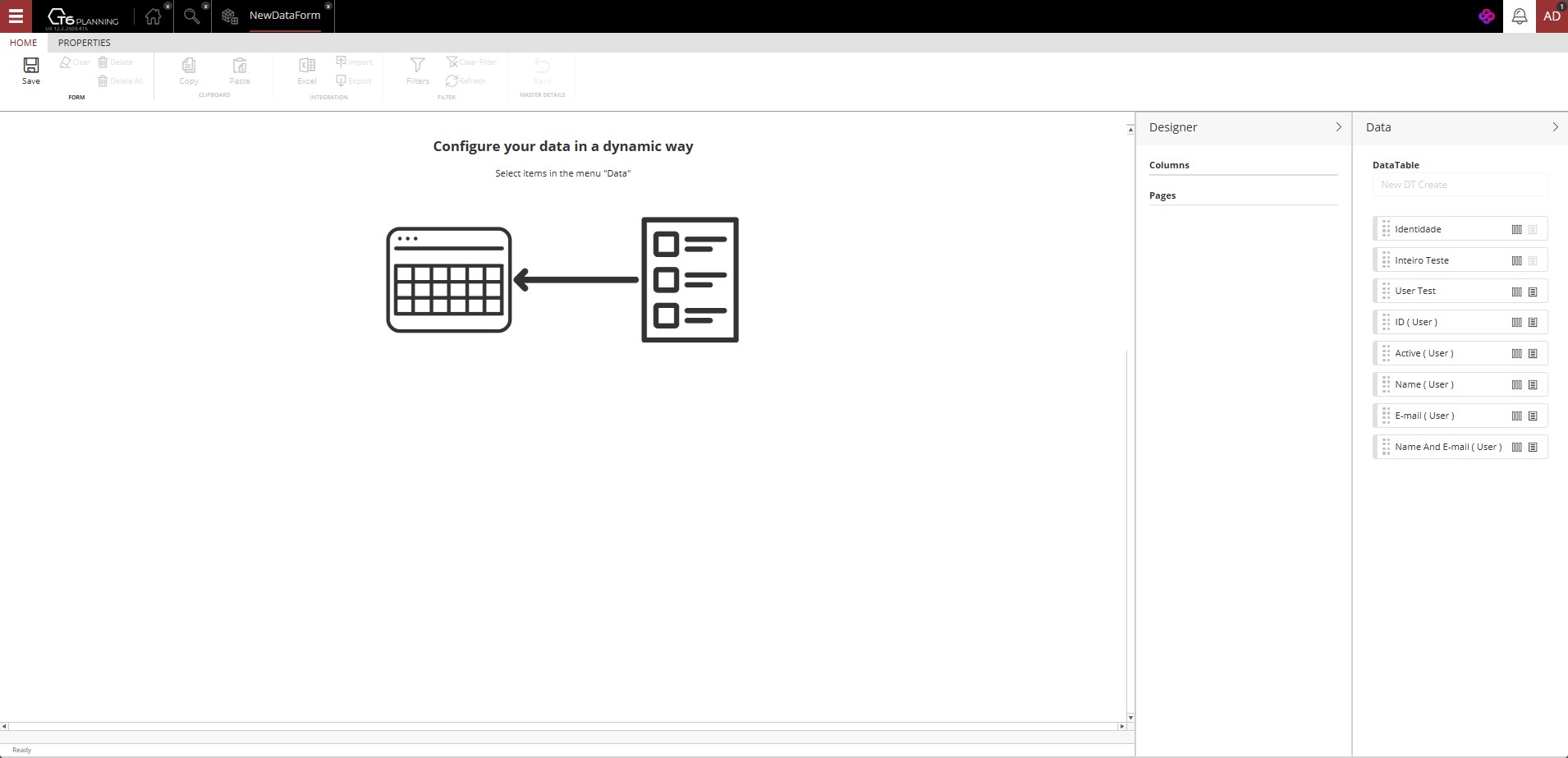
The editor is divided into side panels:
- Data: lists all the available columns in the linked Data Table.
- Designer: allows you to choose which columns will be displayed in the form and how they will be organized.
- Pages: displayed only when there are columns of type Data Link (such as "User" or "Data Table") or column metadata of type Dimension. These pages allow you to create subdivisions of information within the form.
When adding columns in the Designer, the form preview is updated in real time.
¶ Designer
When we add a column from the Data Table to the Designer panel, some interactions will be possible, depending on the type of column added.
-
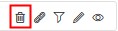 → Delete: Available for all column types. Removes a column from the Designer panel.
 -
 → Link Column: Available for all column types. Allows linking the selected column to an existing data form; when we create the link, we can access the associated form without leaving the source form.
 -
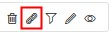
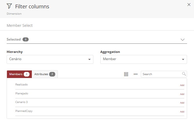
 → Filtering: available only for columns of type Data Table or Dimension during editing.
- By clicking the filter icon, a side panel will open, where we select the Hierarchy and the Aggregation Type. For more information on aggregation types, see: Member selection. In this panel, we select the members and/or attributes that will be displayed in the selected column.
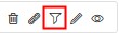
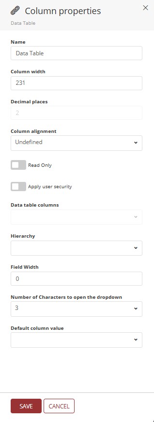
 → Edit: Available for all column types. By clicking Edit, a side panel will open where we can change the properties of the selected column. The following fields are available:
-
Name: allows changing the display name in the form header.
-
Column Size: allows changing the dimension of the selected column (default value 210px).
-
Decimal Places: Allows defining the number of decimal places to be displayed after the comma in a decimal number (available only for columns of type Value).
-
Column Alignment: dropdown where we can define the alignment of the data within the selected column (options Undefined, Left, Center, and Right).
-
Read Only: switch button; when disabled, allows writing in the cells of the selected column; when enabled, writing in the cells is blocked, allowing only data reading;
-
Apply User Security: we can use the flag "Apply User Security" in data form columns, making the displayed records filtered based on the logged-in user, hiding records intended for other users. To perform this filtering, a query-type Data Table will be required, where we bring the system users. We will use this Data Table to link with a column in the data form, thus allowing filtering by logged-in user. To apply this filter in pages, it will be necessary to create a Data Table to which we will link the data form identifier and add it in "Pages", applying user security and selecting, in the dropdown, the column we want to filter from the Data Table.
-
Data Table Columns: will only be enabled if the "Apply User Security" flag is active. Enables a dropdown for selecting a specific column of the associated Data Table.
-
Hierarchy: field enabled only when we have a column with a direct link to another column of the same Data Table.
-
Field Width: will only be applied when the opening type is set to Panel. The width limit for displaying a column in a panel is "12"; thus, if the value is set to "12", the column will occupy the entire row; if we set the value to "6", we will have two columns displayed in the same row, and so on.
Example: In the image below, we have the display of a data form with the view mode set to Panel.
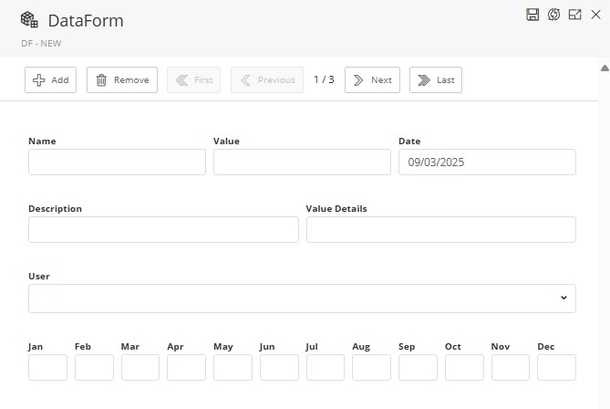
- In the first row, we have the display of "3" columns, as their width was set to "4".
- In the second row, we have the display of "2" columns, as their width was set to "6".
- In the third row, we have the display of only one column, as its width was set to "12", thus occupying the entire available width in the panel.
- In the fourth row, we have the display of "12" columns, as the width was set to "1".
-
Number of characters to open the dropdown: available only for columns of types Dimension, User, and Data Table. We can define how many characters are required to display the available options for selection; the default value is 3 characters.
-
Default value for the column: Through this field we can define a default value that will be displayed as an example before data entry; we can enter any value as long as it respects the insertion format allowed by the column. In a column with a defined default value, if we add a new row in the form without filling in data in the column in question, it will be automatically filled using the value defined as the default.
Example:

-
View: the View option will only be enabled for columns of type Data Table, or columns linked to a Data Table. When we click the icon
 , a side panel will open where we can select the metadata that we want to be displayed in the form cell.
- Metadata: are reference information and cannot be changed directly by the form.
¶ 3. Settings
¶ Edit Tab
The Edit tab centralizes the form settings.
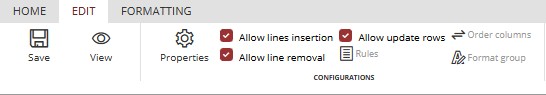
-
Save Button: Saves the settings and the arrangement of defined columns and pages.
-
Edit/View: Button that allows us to switch between edit and view modes without the need to change screens or reload the page. In edit mode the form configuration options will be active, while in View mode the configuration options cannot be changed.

←→

Properties Button: When we click Properties, a side panel will open, where we will define:
-
View Mode: controls how the form will be displayed (Standard, Panel, Dynamic, or Window).
-
Permissions: We have the following checkboxes:
- Allow inserting rows – enables the inclusion of new records.
- Allow removing rows – allows the deletion of existing records.
- Allow updating rows – allows the editing of records.
¶ Sorting and Formatting
- Sort Columns: allows defining the display order by selecting multiple columns and opting for ascending or descending order (alphabetical for text-type columns).
- Formatting Group: applies predefined styles to the form. When we click it, a side panel will be displayed where we will select a formatting group via a dropdown.
¶ Formatting Tab
In addition to the settings from the Edit tab, it is possible to apply visual styles:
- Selecting a previously created Formatting Group.
- Using Ribbon tools for specific adjustments.
More details at: Formatting.
¶ 4. Step by step
- Access the T6 main menu.
- Select the Explorer option.
- After accessing Explorer, navigate to the desired location to create the object.
- Click New Item in the Ribbon.
- Click Data Entry to display the available options.
- Select the Data Form option.
- Open the created object, with a double click or via the Ribbon, by clicking Open.
- The screen will be updated, displaying two options: Create a new Data Table and Use existing Data Table.
- select one of the options.
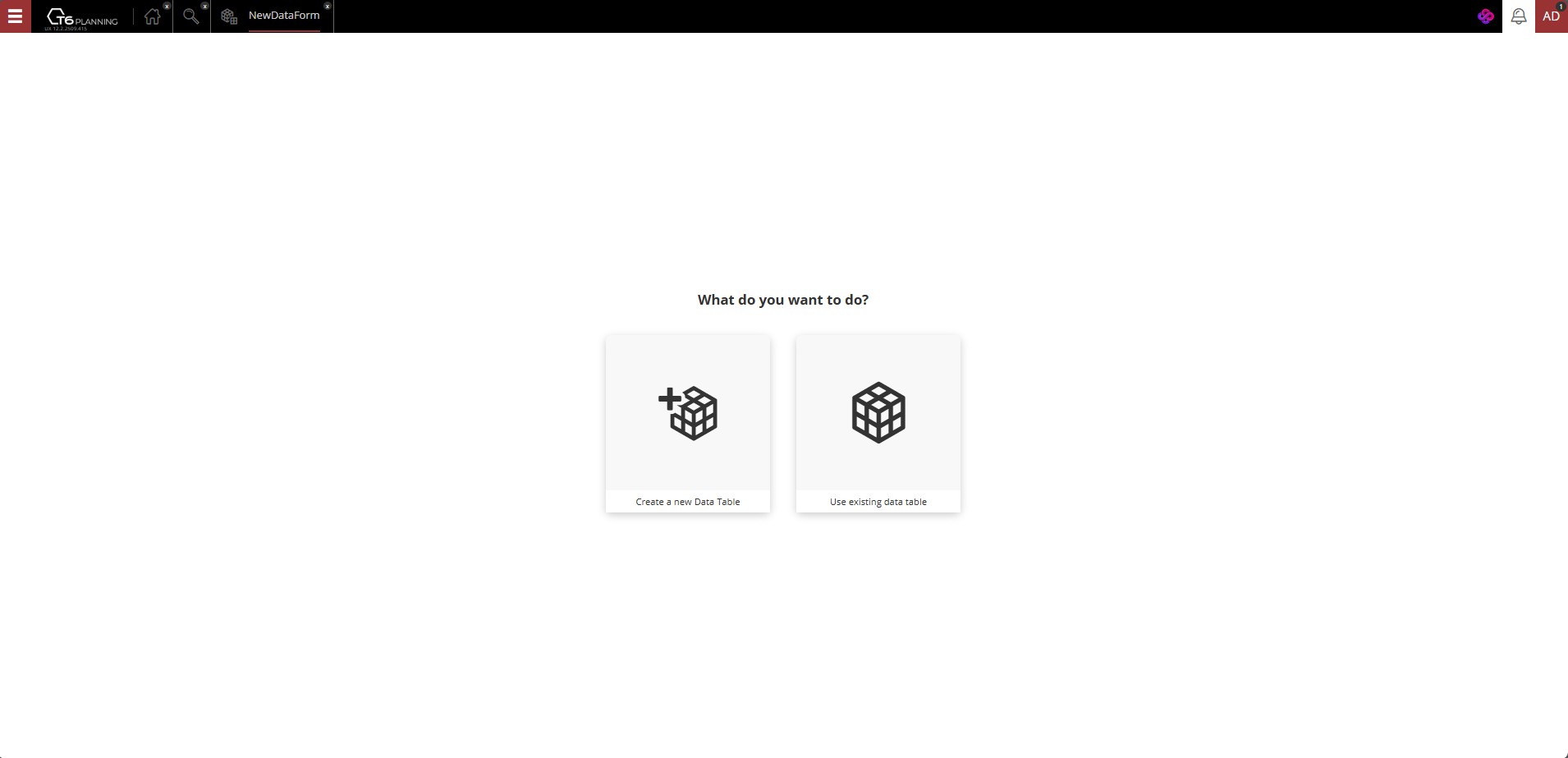
- Create a new Data Table: For more details about this process, see the Data Table creation documentation.
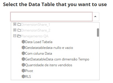
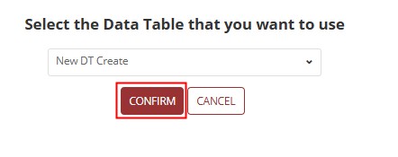
- Use Existing Data Table: A dropdown will display all previously registered tables, organized by folders according to the Explorer's folder hierarchy. Simply choose the desired Data Table to link it to the form (if the user does not have permissions to create data tables, the previous screen will not be displayed, forcing the user to select an existing table).
→
After selecting the Data Table, the configuration and editing screen for the form will open, where we will configure the data dynamically. Initially, no row, column, or page will be displayed; we must configure the layout through the Data and Designer panels.
¶ Edit Mode
- In the Data panel, the columns of the previously selected Data Table will be displayed. Click "|||" to add as a column. Click "≡" to add as a page. It is also possible to define the layout using drag and drop.


-
When selecting a column from the Data Table, it will be placed in the Designer panel, respecting the previous selection (column or page), and will be reflected alongside, in the data form preview.
- To change the order of arrangement of columns and pages, after adding them to the Designer panel, change the display order using drag and drop.
- After defining the arrangement of columns and pages, access the Edit tab and configure as needed (Settings).
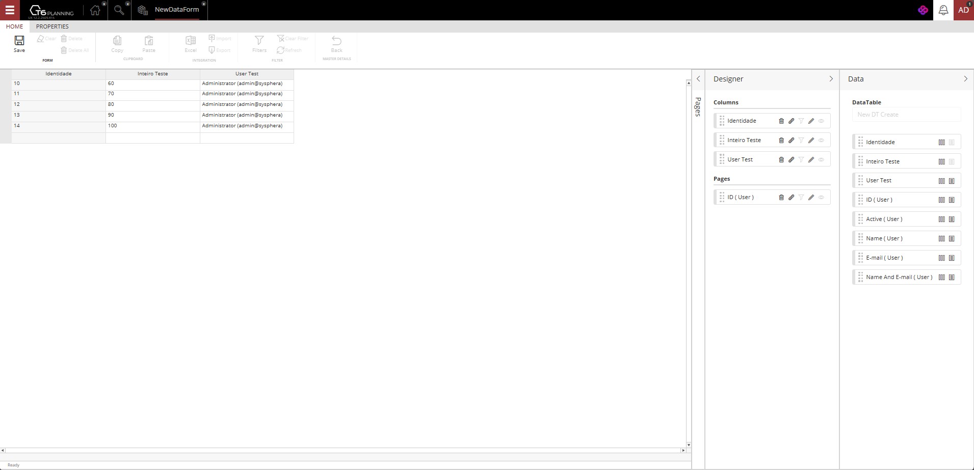
- To finish creating the data form, return to the Home tab and click Save.
Attention: If you switch between viewing/editing modes without saving, the changes made will be lost.
After saving the form, it will be ready for use.
¶ View Mode
When accessing the data form in View mode, the form will be displayed according to the configuration performed in edit mode, with the tools in the Home tab available for interacting with the data.
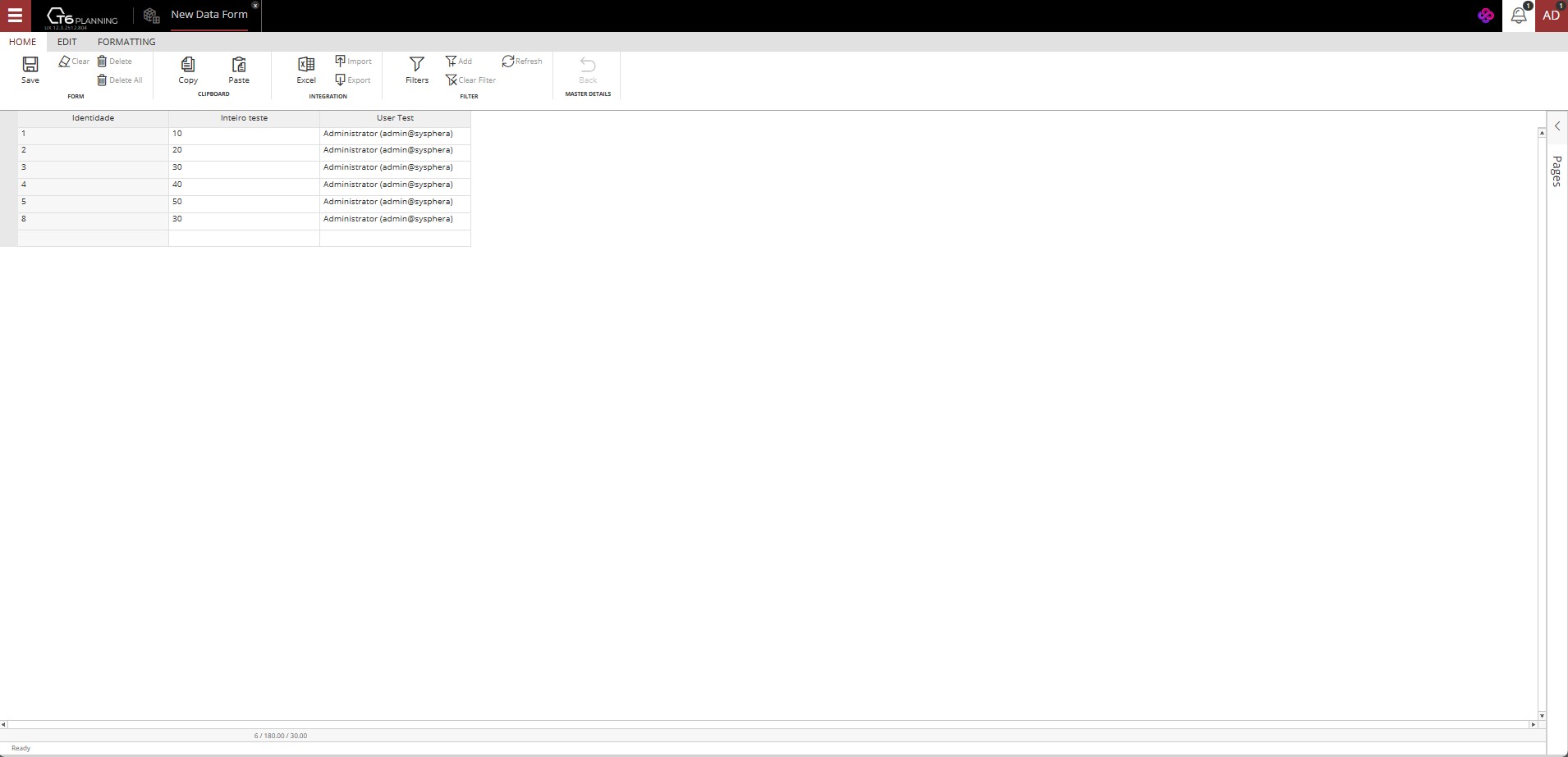
In the Home tab, we have the following functionalities:
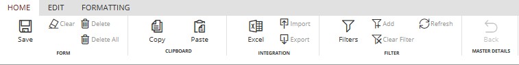
- Form.
- Save: Any change or addition made to a data form is only actually applied when clicking the save button. If you close the data form without saving, all changes made will be lost.
- Clear: Removes the value from a cell or range of selected cells, leaving them blank.
- Delete: Deletes the record corresponding to the row where the selected cell is located.
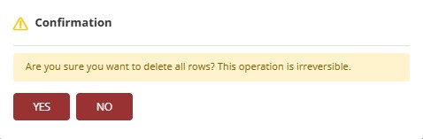
- Delete All: Deletes all records displayed in the open data form. When clicking this button, a confirmation window will be displayed to prevent accidental deletions.
-
Clipboard.
- Copy: Select the cell or range of cells you want to copy. You can do this by clicking on the cell and dragging the cursor over the range of cells you want to select and click copy. You can use the keyboard shortcut Ctrl+C to copy the cells.
- Paste: After copying the cells, you can paste them in a new location. Click on the cell where you want the information to be pasted and press the paste button. You can use the keyboard shortcut Ctrl+V to paste the cells.
-
Integration.
- Excel: For information regarding installation, configuration, and usage, access our help center: Excel Add-in..
- Import: Allows importing data from
.csvformat files to the open data form. - Export: Allows exporting data from the open data form to a
.csvformat file.
-
Filter.
-
Filters: Allows filtering the data displayed in the data form. Through filters, the user can use composite filters with two criteria, connected by logical operators:
- And: both conditions must be true.
- Or: at least one of the conditions must be true.
-
Each filter field has:
- A comparison operator (e.g., "equal to", "greater than", etc.).
- A value field to be filled based on the column data type.
Click to view Operator Types
| Operator | Description |
|---|---|
| is less than | Returns records with a value lower than specified. |
| is less than or equal to | Includes the specified value and lower ones. |
| is greater than | Returns values higher than defined. |
| is greater than or equal to | Includes the value and higher ones. |
| contains | Returns records whose content includes the informed expression. |
| does not contain | Returns records whose content does not include the informed expression. |
| starts with | Returns records whose content begins with the informed expression. |
| does not start with | Returns records whose content does not begin with the informed expression. |
| equal to | Exact value. |
| different from | Excludes the informed value. |
| is blank | Returns rows without information in the column. |
| is filled | Returns rows with any value in the cell. |
- Add: When selecting a cell from the data form and clicking Add, filtering will be applied based on the value of the selected cell applying an equal to type operator, displaying only corresponding values.
- Clear Filters: Removes all applied filters, displaying again all records from the data form.
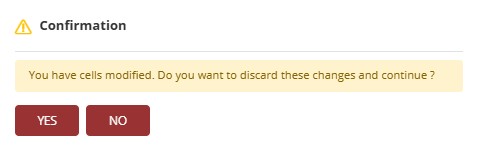
- Refresh: When clicking refresh, external changes made to the form will be applied, through other means, such as applying an expression or a formatting group. However, if you have changed any internal data within the form and it has not been saved, the system will display a confirmation message, informing that there are modified cells and proceeding with the update without saving them will result in the loss of modifications.
- Details Table.
- Back: When navigating in a data form linked to another form through a data link type column, the Back button allows returning to the previous form. For more information, access: Main and Details.
¶ 5. Q&A
Frequently Asked Questions
1. What is a Data Form in T6?
The Data Form in T6 is a feature used to view, insert, update, and remove records from a Data Table, acting as an interaction interface with the database.
2. When creating a Data Form, what is the difference between creating a new data table and using an existing data table?
During Data Form creation, when you create a new data table, you configure all fields directly in the editor without leaving the current screen. When using an existing data table, you select a table already registered in T6 through a dropdown.
3. Which permissions are required to use data forms in T6?
To use data forms in T6, the user must have the manager features Manage the structure of data tables and Create and View Data Entry Forms enabled, and must belong to a global group with Manage Explorer and Manage Data Tables enabled.
4. Do I need to enable any preview feature to use data forms?
Yes. To use the new version of data forms in T6, you must enable the preview feature DataForm New Create or Edit.
5. How is the editor organized in data forms?
In T6 Data Forms, the Editor is where the form configuration is done.
It is divided into side panels: Data (lists table columns), Designer (organizes columns in the form), and Pages (for Data Link or Dimension columns).
6. Which view modes are available in data forms?
T6 data forms provide the following view modes:
Standard;
Panel;
Dynamic;
Window.
7. How can I change a column size in a data form?
During data form editing, in the Designer panel, click Edit on the desired column and adjust the Column Size field (default value: 210px).
It can also be adjusted through Formatting.
8. Can I define a default value for a column in a data form?
Yes. In T6 data forms, in the column editing panel, use the Default value for the column field to define a value that will be shown as a preview and automatically filled in new rows.
9. How does field width work in Panel view mode?
Field width only takes effect when the Data Form is displayed in Panel mode.
The maximum width is 12.
If set to 12, the column occupies the entire row.
6 allows two columns in the same row.
4 allows three columns, and so on.
10. What does the "Apply User Security" option do in data forms?
The Apply User Security option in data forms filters displayed records based on the logged-in user, hiding records intended for other users.
It requires a query-type Data Table with system users.
11. How do I create a link between columns in data forms?
To create links between columns in data forms, use the Link Column option in Designer to create a link between the selected column and an existing data form.
12. When does the "Pages" option appear in data forms?
In the new version of T6 data forms, the "Pages" option appears when there are Data Link type columns (such as "User" or "Data Table") or Dimension-type column metadata.
13. What happens if I switch between view and edit modes without saving changes?
If you made changes in the data form and switched between view and edit modes without saving, the changes will be lost. It is important to save before switching modes.
14. How can I reorder columns after adding them in data forms?
After adding columns in data forms, if you want to reorder them, use drag and drop in the Designer panel to change the order of columns and pages.